Color analysis, Colors, Meet my clients, The power of colors

The Friday Pinspiration II

A little late, but here’s  last weeks Friday Pinspiration.

Every Friday we have a Pinspiration challenge on my Facebook group Colors in Style by Kari Community. We’re having so much fun and I teach my members about colors and contrast levels. Some weeks I choose the Pinspiration and some weeks one of my members choose the inspiration. We would love to have some new members so you are very welcome to apply.

This time I chose the inspirational picture, a very casual look most can copy.


74342219_10156417293082657_4552419519896748032_n

So here’s my version. I was in a hurry so pics are not the best. I chose a coat instead of a cardigan as for me something more wind proof is more practical I would freeze in a knitted cardigan. I also had to add a scarf. I also chose a much smaller bag.

I am a Contrasting Autumn so I dress according to my season and contrast level.

Coat – Zara, sweater * Masai, jeans – Momento jeans, bag – Dune


This week it was Laurie- Annya I thought had the best outfit, she is a Light Summer and looks so elegant in her soft summer colors. The colors plays so well up with her personal coloring.  You nailed this Laurie- Annya, grey and pink for the win.

Laurie (2)

One inspirational pics, so many possibilities. It’s so fun to see all the versions every Friday.


Color analysis $299 (3)


capsule wardrobe, Color analysis, Uncategorized

Why knowing your colors can save you money

This is a post I made in 2018, but I think it’s very relevant this time of year. A winter coat is often a big investment and getting it right is essential so you can wear and love the coat in years to come.

I guess most of you can relate to the scenario I’m now going to describe. It’s not real, but I have been in a similar situation several times and so have probably you. Ok here we go.

Jeg er sikker på at mange av dere kan kjenne dere igjen i følgende scenario. Det er en tenkt situasjon, men jeg har vært borti lignende situasjoner mange ganger.

It’s the January sale and i have decided to buy a new coat. I want a nice classic coat that will last for years and one day I find this Gant coat 40% off. It’s still not a cheap coat, but it’s really good quality. I’m a bit sceptic about the color, but the girl in the shop says the coat looks fabulous on me, so I buy it.  After all I’ve been looking for a while, and this is 40% off and it’s Gant. Initial price was $490  and now it’s $295

IMG_2417

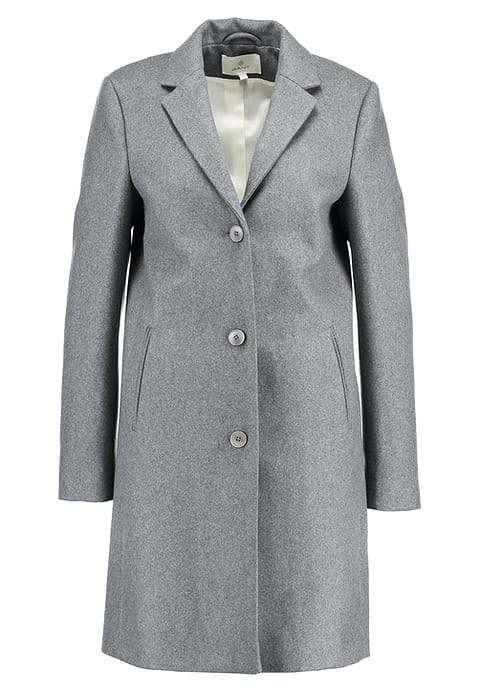
Det er januarsalg og jeg har bestemt meg for at jeg skal kjøpe en ny kåpe, jeg ønsker meg en klassisk kåpe i god kvalitet som jeg kan ha i mange år. Jeg finner denne grå kåpen fra det kjente merket Gant. Jeg er litt skeptisk til grå kåpe, men ekspeditrisen en ung dame som ser helt fantastisk ut forsikrer meg om at jeg virkelig kler denne kåpen. Jeg har sett etter kåpe en stund, den ser fin ut der jeg står i prøverommet. Den er fremdeles dyr, men det er tross alt en Gant kåpe og det er 40% på den. Det er også den siste igjen i min størrelse og de fyker ut ifølge ekspeditrisen. Den har kostet 3795,- nå er den 2275,-.

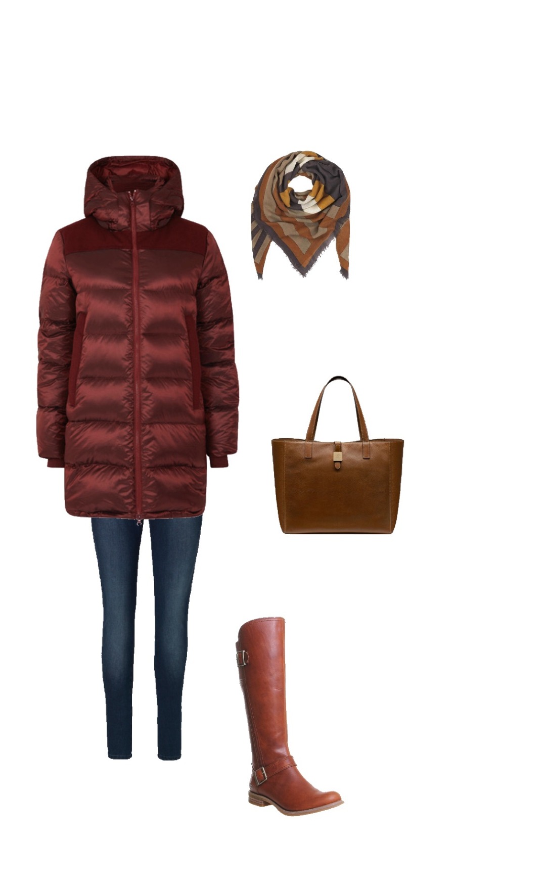
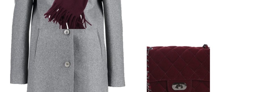
When I come home I realize I actually don’t have much that goes with this coat. I need scarf for the coat. After all I do live in Norway where we have real winter. I search on Pinterest to get inspiration. And fall in love with the grey and burgundy outfits. This is how I want to style the coat.

I go out searching for a scarf, I find a beautiful burgundy, but it’s insanely expensive it’s almost $130 on sale. I leave it and find another nice one for only $25, but then I find this really cute hat and it doesn’t go with the cheaper scarf, so I need to go back get the expensive one too. Now I have the perfect outfit. Or do I??

Så er det ut på jakt etter et skjerf som passer til kåpen. Jeg finner et helt nydelig burgunder skjerf, men det koster nesten 1000 kroner så det går jeg fra og finner et jeg liker som bare koster 199. Så begynner jakten på en lue. Jeg kan ikke finne en eneste lue som passer til det billige skjerfet, så jeg må til slutt gå tilbake å kjøpe det dyre skjerfet som passer perfekt med en fin lue jeg fant. Nå har jeg det perfekte antrekket, eller??

I’m ready to go out in my new winter outfit, but this day it’s really icy and the boots I planned to wear with this outfit don’t handle icy conditions and I most likely end up with a broken hip if I use them. The only boots I own that’s safe in these conditions stands out like an eye soar. I need new boots and actually I need a new bag too, because none of my bags work with this outfit.

Da er jeg klar til å ta i bruk min nye vinterkåpe, men akkurat denne dagen er det ganske isete og de støvlettene jeg hadde planlagt å bruke er fryktelig glatte og jeg har ikke lyst å brekke lårhalsen. Mine Timberland skoletter som har gode såler passer jo ikke til og egentlig har jeg ikke en veske som passer heller…..

IMG_2421

Time flies they are starting to get sold out for winter boots, it’s difficult to find the perfect pair in my size. In desperation I end up with a pair of black over the knee boots. They are suede which is not very practical where I live, but they have rubber soles. They don’t come cheap they are $233 on sale, but luckily I found a nice burgundy bag for only $39.

Tiden går og de begynner å bli utsolgt for støvletter, det er vanskelig å finne det perfekte paret i min størrelse, i desperasjon ender jeg opp med et par semskede over kne støvletter. Semsket er ikke så veldig praktisk på Vestlandet, men disse har gode såler. De er ikke akkurat billige de koster 1895 kroner, men heldigvis finner jeg en fin burgunder veske til kun 299,-.

IMG_2425

It’s February and I finally found all I needed for this new coat. The total amount I’ve used is $722, but I guess it’s an investment. It’s a lovely sunny day first time I finally wear the coat. I meet up with some friends, no compliments in fact a couple of my friends looks at me and ask if I feel ok. I look so tired and pale they say with concern in their voices. I feel perfectly fine, in fact better than in a long time. So why do I look so pale and washed out? I conclude it’s the burgundy and decide to buy another scarf and hat to go with the grey coat. Back to Pinterest to find inspiration. Maybe pink will be better…

Det er blitt februar og jeg har endelig komplett antrekk. jeg har riktignok brukt 5668 kroner, men jeg regner det som en investering. Det er en solskinnsdag i februar jeg bruker den nye kåpen for første gang, jeg skal møte noen venninner til lunsj. Jeg får ikke en eneste kommentar om mitt nye, fine, dyre antrekk. Isteden får jeg noen bekymrede blikk og spørsmål om jeg føler meg bra. Jeg føler meg helt fin jeg, bedre enn på lenge faktisk, så hvorfor ser jeg da så blek og sliten ut?? Jeg konkluderer med at kanskje det er det burgunder tilbehøret og så går jeg hjem for å finne annen inspirasjon på Pinterest. Kanskje rosa….

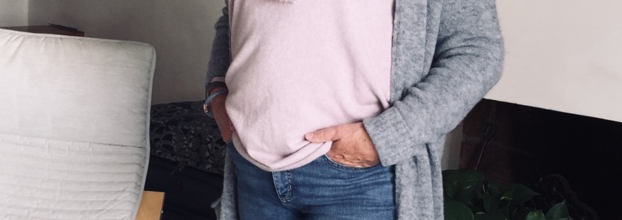
Next day I wear my real old, olive jacket and a rust scarf while out on a Sunday walk. I meet one of my friends from yesterday, she compliments me and is happy I feel better. And I even don’t have any make up on!!

Dagen etter er jeg på søndagstur, uten make up ikledd min gamle olivengrønne jakke og med et rustfarget skjerf tullet om halsen. Jeg møter igjen en av venninnene fra i går og hun kommenter hvor fresh og opplagt jeg ser ut.

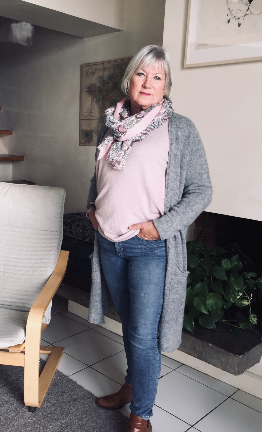
So why was this such disaster? First of all, grey is a really bad color for me. I known that for a long time, charcoal is ok, but all other greys wash me out. Second burgundy is if  possible an even less flattering color on me than grey. But grey and burgundy is a beautiful combination and it’s so easy to be tempted when you see all the great outfits. Most pinks are not my colors either, so buying pink accessories would not have helped much.

Så hvorfor ble dette nye antrekket som jeg har brukt så mye tid og penger på ingen suksess? Først og fremst fordi de fleste gråfarger ikke kler meg og burgunder er en farge som om mulig er ennå verre enn grått på meg.  Jeg ser ut som om jeg står med en fot i graven om jeg går med burgunder. Men nå har jo grått og burgunder vært veldig i motebildet og for dem som kler det er det en fantastisk kombinasjon. De fleste rosafarger er heller ikke mine farger, så å kjøpe rosa sjal hadde ikke hjulpet så veldig mye.

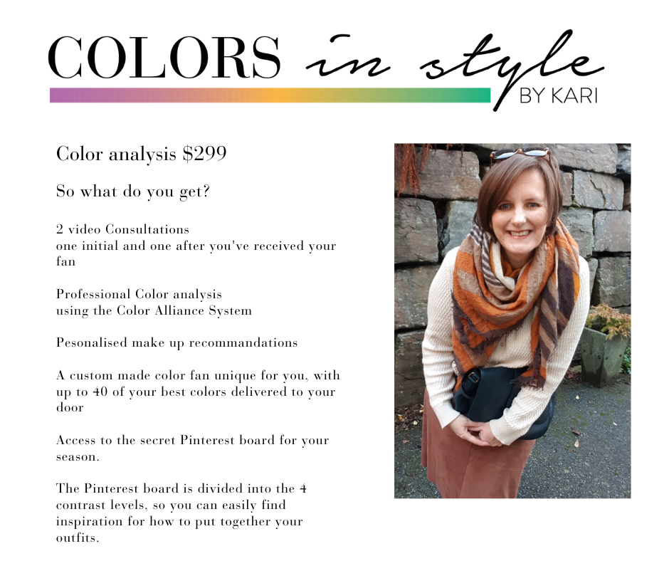
Having a capsule wardrobe and being much more conscious when I shop is very helpful, I always think if I have at least 5 items at home to go with it. And after having my colors done, wich I payed $300 for, I know what to look for colorwise. I have a core closet in colors which suits me, and accessories in my colors too. So when I the other day found a down coat for $77 in one of my best colors a rust/mahogany color I didn’t hesitate. I have been a lookout for a nice warm coat for a while. I took it home well aware that I didn’t need to buy anything else to make this coat work. It goes with all of my boots, with several of my scarves and at least one of my hats. So total cost for the coat was $77. If I add the cost of the color analysis the cost is $377 so I actually saved $345 opposed to if I’d bought the grey coat. Yes I know it’s a constructed scenario and that the clothes in the example are quite expensive, but even if they had been much cheaper it would still have been a vaste of money, because honestly how many times do you use something that you know don’t suit you?

IMG_2428

Heldigvis hadde jeg ikke gjort denne feilen nå, med kunnskapene om kapsel garderobe i bunn så hadde jeg nok ikke kjøpt en kåpe uten å vite at jeg har minst fem ting hjemme som passet til. Og etter å ha vært til fargeanalyse i fjor høst som jeg betalte 1800,- kroner for så hadde jeg ikke sett på en grå kåpe i utgangspunktet. Her om dagen kom jeg over en dunkåpe på salg, jeg trenger en varm kåpe og denne var i en mine beste farger. Den kostet 650 kroner og jeg visste at jeg ikke trengte kjøpe noe annet for å kunne bruke denne kåpen. Den går til flere par støvletter, sjal, hansker og luer. Så totalkostnaden på denne kåpen er 650,-. La meg så for moro skyld legge til kostnadene for fargeanalysen. Da er kostnaden 2.450,-. Så da har jeg faktisk spart 3218 kroner bare på dette ene kjøpet. Ja jeg vet at dette er et konstruert tilfelle og at klærne i eksempelet er ganske dyre, men dette var ting jeg falt for og likte da jeg surfet rundt på nettet for å finne eksemplene. Men uansett om det hadde kostet mye mindre så hadde det likevel vært bortkastede penger, enten hadde jeg rundt å sett skikkelig syk ut i årevis, eller jeg hadde mest sannsynlig følt det var feil for meg og ikke brukt dette antrekket.

Now I use colors I never even considered before, I learned that I’m an autumn and I suit colors like mustard, rust and olive green. In the long run this will save me a lot of time, frustration and money.

Nå bruker jeg farger jeg ikke ante jeg kledde, oker, sennep, rust, oliven. Jeg vet at høstfarger kler meg og at jeg i der lange løp kommer til å spare mye tid, frustrasjon og penger.

So to conclude, if you don’t have any idea which colors suits you and if you recognize  the story about the grey coat, maybe you should consider get your colors done? Knowledge is power also when it comes to knowing yourself.

Så konklusjonen er, har du ikke peiling på hvilke farger som kler deg og om du kjenner igjen historien om den grå kåpe, så kanskje du skal vurdere å ta en fargeanalyse. Kunnskap er makt også kunnskap om deg selv.

Until next time

Kari


Join my fun little group on Facebook where we do discuss things like this, we have different challenges. We are women from all over the world and we love colors. Colors in style by Kari Community.


Contact me if you want to have your colors dome, I’ve helped women from every continent to find the colors which makes them shine. I would love to help you too.

kari@colorsinstylecom


Color analysis $299 (3)


Uncategorized

The Friday Pinspiration

Every Friday we have a Pinspiration challenge on my Facebook group Colors in Style by Kari Community. We’re having so much fun and I teach my members about colors and contrast levels. Some weeks I choose the Pinspiration and some weeks one of my members choose the inspiration. We would love to have some new members so you are very welcome to apply.


This week Ulla from Sweden chose the Pinspiration (we are a very international group)

This elegant sophisticated woman who I have no idea who are looks just great in this very classic outfit. The crisp white shirt, the navy blazer, the jeans that are cuffed under, ther pearls and the Chanel like bag. The white sneakers makes the outfit more relaxed and casual.  This would be a great outfit for a contrasting winter. If the shirt had been softer white a contrasting summer could also used it. And if the shirt was more cream this would be an outfit for also contrasting springs and autumns. To be a real contrasting outfit a little splash of a bright color should be added for all the seasons. Maybe a bag in a bright color or a scarf, a bright lipstick would also make a pop.


72729761_10215774996668994_5257092111206973440_n

So how to translate this outfit to a Contrasting autumn like me? I chose my copper blazer as that is what I have picked for a 10 x 10 challenge we’re also having in my group.

I also chose a cream/sand cardigan as shirts are difficult for us big chested girls and I chose to use items from my challenge. I’m not a pearl person, but I found a necklace in my jewelry box I decided to try, forgot my bag. I first tried to pose as the sophisticated sitting on a chair, but that just looked plain stupid.

20191018_172811[8398] (3)

Every week I will also feature one of my clients who I think have solved the challenge good. The criteria is they should use both their season and their contrast level.

IMG_4790 (2)

Robin is a Contrasting Solar Winter and she has picked emerald green as her main accent color this autumn. I have declared her the Poshmark queen as she has found so many great quality items on there. Poshmarks is a second hand site in USA. Fun fact, she already had planned this outfit sans the pearls before the Pinterest challenge was posted. The elements are exactly the same, but see how much difference the color does. 

So who will be featured next week???

That remains to be seen.


Color analysis $299 (3)


Color analysis, Featured, Uncategorized

October Raffle

Time for a raffle. Everyone who books either a Color analysis or a body analysis in Ocober will have the possibility to win a price.

If you book a Color analysis you can win either a Body analysis or make up from Color Me Beautiful  worth $100

If you book a Body analysis you can win either a Professional color fan (that if you have a color analysis from before) or Make up from Color Me Beautiful  worth $100

Please note if you live outside USA the freight for the make up is not included in the prize.

Also note that it have to be at least 10 bookings for Color or Body analysis to do the raffle.

Color analysis – $299

Body and face analysis – $199

I also do a separate Face analysis for $59 if you book only this you can win CMB make up worth $50

There will be one winner only, and it will be a random draw November 1st.


You are also welcome to join my group on Facebook. Colors in style by Kari Community. We are a colorful bunch of people from all over the world and we have a lot of fun.


You can send me an email to kari@colorsinstyle.com if you want to book, also if you have any questions feel free to ask.


Let's have a october Raffle 3)

Colors, Front page

Living Coral Pantone color of the year

I just have to say it, Coral is one of my favorite colors, and when I saw Pantone had selected this beautiful Coral as the color of the year I see there’s hope for my spring and summer wardrobe. I do have a couple of shades of coral in my personal palette. I have a few pieces of Coral in my wardrobe already, but it has been hard to find the shade I love and prefer. I cross my fingers and hope it will be easier now, after all it’s the color of the year isn’t it?

Coral is a typical spring color, so most springs can look forward to a splurge. I say most springs, because there are some springs that coral are not a great color for, but they are in a minority. Also some of us autumns can look forward to this color fiesta. Coral is a warm and bright color, so it might be a little bright for many autumns, but as always I think there will be a variety of coral colors, in different shades. An autumn would typically look for a more burnt version of the color.

For most summers and winters among us coral is not a color to count on. Again I say most, as we are quite unique in our coloring there’s always exceptions from the rule.

Last year it was a purple which was the color of the year. To be honest I didn’t see very much purple around, at least not here in Norway. Now I do hope that this year will be different. Or maybe this is the year we will se the purple and have to wait to see the coral until next year?

Next time I will write about some of the other Pantone colors for spring 2019, so stay tuned.

Until next time

Kari

capsule wardrobe, Colors, Featured, Front page

10 reasons why you should get a Color analysis

Maybe you like me had a color analysis in the 80’s or 90’s? Maybe you were happy with the result and has remained true to your season ever after? Or maybe not? Color analysis now are very different from back then. It has been a tremendous development and now the Color alliance system can provide you with your unique palette made out from your personal coloring. You will not only know your season, but also your contrast level and if you can borrow colors from other seasons your personal palette will contain these colors, too.

For many years fashion industry brain washed us to believe that black is a color for everyone, they even managed to brain wash me. I found it difficult to find colors from my spring palette and if you looked for anything else then black you had a hard time, so in the end I gave in and followed the crowd. A couple of years ago my wardrobe was at least 80% black, and for some reason I was unable to see that it was not a good color for me. When I look at myself in the mirror I’m not able to tell, but when I look at photos I can tell immediately. The thing is I rarely saw photos of me, after all I’m not in the selfie generation and i have been the photographer and not the model for the most. When I on occasions saw a photo of myself, looking really drab and tired in my black clothes I just assumed it was how I looked. Age does take it’s toll after all.

DSC_0311

Long story short, I discovered the concept capsule wardrobe and started to write this blog, my friend Kari persuaded me to be a model myself- (in the beginning I used a mannequin doll)  It went surprinsingly well and I actually didn’t look drab, tired and old on the pics. Why? Because i had packed away my black clothes for summer and spring and decided to use navy as my base color. When autumn came I decided to use black as base again. And what a difference. These 2 pics taken in same light conditions within an hour convinced me to never wear black close to my face again.

I also decided to get a new color analysis, as I struggled with my spring colors from the 80’s. To my surprise I came out as an autumn, I was a bit sceptical in the beginning as these were colors I’ve never used before. I bought my first items in my new palette and:

GAMECHANGER, not to mention LIFECHANGER as I  not only found my colors, but also a new career. After a year I took a course and was certified a Color and style analyst in the Color Alliance system. Now my mission is to help others find their true colors.

So here’s 10 good reasons to have a color analysis:

  1. You look younger and more radiant in your true colors.
  2. You feel much better when using colors that really suits you. Somehow we subconcious know when the colors are wrong. but we are not always aware they can make a difference between a good or a less good day.
  3. When you use your palette, you will avoid buying clothes which you will hardly use or never use at all. Who has never had clothes in their wardrobe with tags on? Of course they need also to be for your bodytype, not only color.
  4. You will save money, not only because you don’t buy the wrong colors, but also because you will be much more concious when shopping.
  5. It will save you time, not only when dressing, but also when out shopping. You will no longer waste time in the morning to find a scarf for that exact top, because now most your scarves goes with most your tops. And when you’re shopping you know which colors to try on and you know you don’t even have to look at the clothes in the wrong colors.
  6. You will have more colors to play with, sounds contradicting? Not at all, in your very personal palette you will get 40 colors in hue, intensity and colors for your unique coloring. Maybe you think you don’t suit red, but most likely you do, you just haven’t tried on your red yet.
  7. To buy make up will be much easier, especially lipstick and nailpolish. You just bring your palette and find a color that matches your swatches. You will also know if you’re cool or warm, and which intensity you should choose out from your contrast level.
  8. If you dye your hair it will also be easier as you will know what to ask for when you’re at the hairdresser. Let’s face it not all hairdressers would know if you should have a cold or a warm hair color. And if you dye your hair yourself you will know what to look for.
  9. You will receive many compliments when wearing your true colors. You just as well get used to it, and learn how to say thank you.
  10. It’s a good investment in yourself, in your self confidence and who don’t want to not only look younger, better, more radiant and in the same time save money in the long run?

If you’re interested in a color analysis I am here to help you out. I work with clients both online and in person., I aim to make the online analysis as personal as possible so during the process I talk at least 3 times with my clients in face to face calls. It’s a longer and more complicated process online than in person, but the result will be the same.

Price is $ 299,- this includes a customized color fan, make up tips and we go through the fan together after you receive it.

You can contact me on the contact page or send an e-mail to kari@colorsinstyle.

Follow me on Facebook, Instagram and Pinterest: Colors in style by Kari

Until next time

Kari

kari-colorsinstyle-emblem

Uncategorized

Tablesetting for the Holidays

I just love to set the table for our Christmas dinners, it’s my favourite task on Christmas eve. When our Christmas dinner is cooking I sing Christmas carols and set the table. I never plan very much ahead, and if I do I might end up with something quite different. Christmas eve you might ask? Yes in Scandinavia Christmas eve is the most important day of Christmas, actually for many the most important day of the year.

45621900_2333133356973522_1623869182623875072_n

I’m not that fond of using the traditional Christmas red, so I always go for other options, using stuff I already own. This year I wanted to use these burgundy velvet placemats as they go very well with the vibe in our house. Actually when I was visualising this I also had some gold cover plates in mind, but I skipped those. As I said if I plan ahead I always end up with something different. I personally am not a big fan of table cloths, mostly because it’s such a hassle to wash and iron them.

45488802_257432588293880_1926127072288178176_n

The place mats, plates and napkins are not screaming Christmas, but when I make the centre piece with  Christmas effects only  you can clearly see this is a table set for a Christmas dinner. A little faux spruce branch on the plate leaves no doubt either.

45554225_1173288202826207_3084112515135700992_n

A bow made of gift ribbon and a small wooden heart makes the wine glasses more festive, and my mums old dessert bowls brings in a breathe from the past. I’m a big fan of something old and something new. The plants on the table are very trendy now here in Scandinavia, so are the velvet. Araucaria heterophylla is a beautiful spruce miniatyr spruce tree and the Christmas rose as we call the Helleborus can even be placed outdoors even here in Scandinavia. 

45643528_2457316484308814_4660508956085452800_n

I made this centre piece with my grand daughters in mind, I think they will enjoy this small winter landscape, spruce trees, a deer, a little boy, a small house and even a toy car with a spruce tree. The gold is the “red thread” in this, the gold centre piece, the gold cutlery and the gold flowerpots ties it together. If I replaced the gold with silver it would be a complete different look.

46181756_10155664111087657_4654760155244658688_n

Of course it’s no room for food on this table, so in our home the food is placed in the kitchen and people go serve themselves. A tip about centre pieces, you are most likely to succseed if it’s the same shape as your table. So if you have a round table you should use a round centre piece, if you have a square table a square one.45611453_2248670521818979_783783337691971584_n

A little about how we celebrate Christmas in Norway. Christmas decorations are normally not up before the first Sunday of advent. We start out with advent candles which is four candles and we lit one every Sunday until Christmas. Every house has at least one advent star in the window. I use to have  several all over the house as I love these stars so much. Traditionally the tree don’t come up before 23rd of December in the evening, some are still following this tradition. After plastic trees taken over more and more we tend to put up the trees earlier and earlier, especially the younger generations. We always have a real tree, last year we actually had a live tree in a pot, soil and all. I decorate the tree the last week before Christmas.

45716254_323756711689159_5317484977795891200_n

As I told before, Christmas eve is our big day. It’s when we have our traditional Christmas dinner and when we open the presents. So what do we eat? Actually it depends much about where you live. In my part of the country, the west coast,  we eat lambs rib, the rib has been salted and dried and in some cases smoked (this does also depend on where you live). 23rd of December we have to remember to put the salted rib in water over night. Christmas eve we steam cook it for hours, and while the the smell is spreading in the house, we watch Christmas films, the same every year, set the table, boil potatoes and prepare the suede mash to serve with the meat. If I don’t eat lambs rib on Christmas it don’t feel like Christmas for me.

In the east of Norway pork rib served with, sausages, potatoes and sauerkraut is the most popular dish and in north of Norway many has fresh cod as their traditional Christmas dinner. No matter where you live and what you eat, one thing we do have in common is the joy of Christmas, and if it’s kids in the house the constant nagging about when we’re going to open the gifts.


Merry Christmas to you all.

Kari 

Uncategorized

How to choose Red for the holidays

It’s not very long before we get into the holidays and red will again be a color many wants to wear. You might think you don’t suit red, but most likely you’re wrong. Most of us do suit some kind of red, until this day I’ve never seen a personal palette without any shade of red in it. True red is a color  considered a neutral as it’s neither cool or warm and can suit any season.

Red for the holidays

So that’s the good news, but does it mean we all suit true red? Not necessarily, we are all individuals and our coloring is very personal to us. Me for instance, I don’t suit True red, I need more warmth to my reds so for me Bittersweet or Tomato red are the best options.

Happy holidays

So how to pick the best red for the holidays? First of all, try the true red, it might suit you, especially if you’re one of those who suits neutral colors in the first place.  If not look for other options. If you are warm toned, a spring or an autumn you have to look for reds with a hint of yellow in it, Bittersweet and Tomato red are examples of these reds. If you’re on the cool side,  a summer or winter, try reds with a hint of blue like Blue red or Deep Rose.

Red seasons

Colors have so many names, so the shades I’ve mentioned might be called something else when you buy something. The producers use different names for the same colors, so basically you should look for a bit of warmth if you’re spring or autumn, or a hint of cool if you’re summer or winter.

It’s not always easy to see if colors are warm or cold, especially not under the fluorescent lights in the shops. This is when having a color fan of some sort is very practical, if you compare the colors with the swatches you will very clearly see if the color is cool or warm. If you still don’t know if you’re cool or warm toned, don’t hesitate to get a color analysis, you won’t regret it.

Happy Holidays everyone.

Signatur